Research Posters
We provide professional large-format research poster printing for the SUNY Downstate community. Get started by downloading our official templates or submit your final design for print below.

Ready to Submit?
-
Proofread Everything: All submissions are final; any re-prints requested due to file errors will be charged at 100% of the cost.
-
Verify Dimensions: We print to the longest width of your selected size while maintaining the file's aspect ratio.
-
Check High-Res Graphics: Ensure charts and photos are high resolution to prevent pixelation.
-
Plan Ahead: Date selections with less than 2–3 business days for production will not be accepted.
Pricing, production times, campus pickup location and other information are included in the form below.
Production Specs at a Glance
-
Turnaround Time: Standard production is 2–3 business days for individual posters. Submissions of 10 or more posters require 14 business days.
-
Materials: Posters are printed on high-quality gloss paper; cloth printing is currently unavailable.
-
Standard Size: Most conferences require 48"w x 36"h. You may request other sizes within the submission form above.
-
Final Submissions: All files are treated as final, print-ready documents. We do not provide design or proofing services.
Official SUNY Downstate Powerpoint Templates
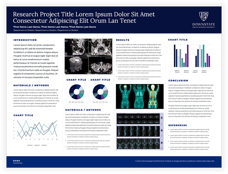
Ensure your research aligns with university standards by using our official PowerPoint templates. These include the correct SUNY Downstate logos and brand-approved typography. Use the link below to download our currently available research poster templates.
Current sizes included are:
48" x 36" (Standard Poster Size)
44" x 44" (1:1 ratio)
General Advice
- The design should be visually appealing, utilizing the capabilities of color, graphics and typography to communicate your poster.
- A clear, simple, uncluttered arrangement is the most attractive and the easiest to read.
- Color should be used sparingly, to provide contrast.
- Illustrations should be simple and eye-catching, with unnecessary detail left out.
- If possible, avoid long numerical tables. Convert complex tables to graphs or charts. Use photographs or colorful graphs wherever possible.
- Photos should be enlarged enough to show relevant details.
- Patient confidentiality must be protected. No names should appear in illustrations.
- Headings of more than six words should be in upper and lower case, not all capitals.
- Use bold characters to stress your point.
- When laying out your poster leave "breathing space" around the text. This increases legibility.
- Use the Downstate brand fonts of Lora (for headings) and Montserrat (for body copy) when possible. Those fonts are available to download here.
- Keep body text left aligned.
- Columns should not vary in width.
Questions or Technical Issues?
If you have questions regarding sizing, pricing, or the submission portal, please contact Sean Thill at sean.thill@downstate.edu.