Typography
Primary and Secondary Typefaces
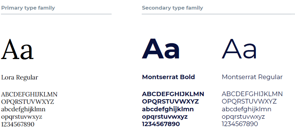
Our primary typeface is Lora. This typeface works best in its regular weight, which is made to be distinctive and clear. Lora is used for all headlines and large text. Our secondary typeface is Montserrat, which was chosen for legibility in large blocks of text. Monteserrat is used for small subheads or notes in its bold weight or for body copy in its regular weight.
Never use Lora for body copy or Montserrat for headlines. The relationship between
these two type families must be maintained at all times.
System Typefaces
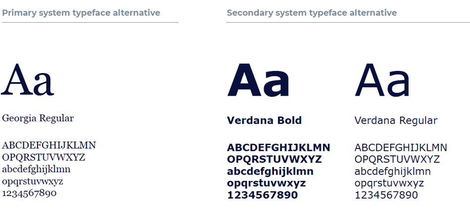
System typefaces should be used when Lora and Montserrat are unavailable, and in the same hierarchal relationship as our primary and secondary fonts. The system typefaces were chosen for their stylistic similarities to our primary typefaces and ubiquity across operating systems and software.
These fonts do not need to be downloaded and should be available on your respective operating system.

Type Relationships
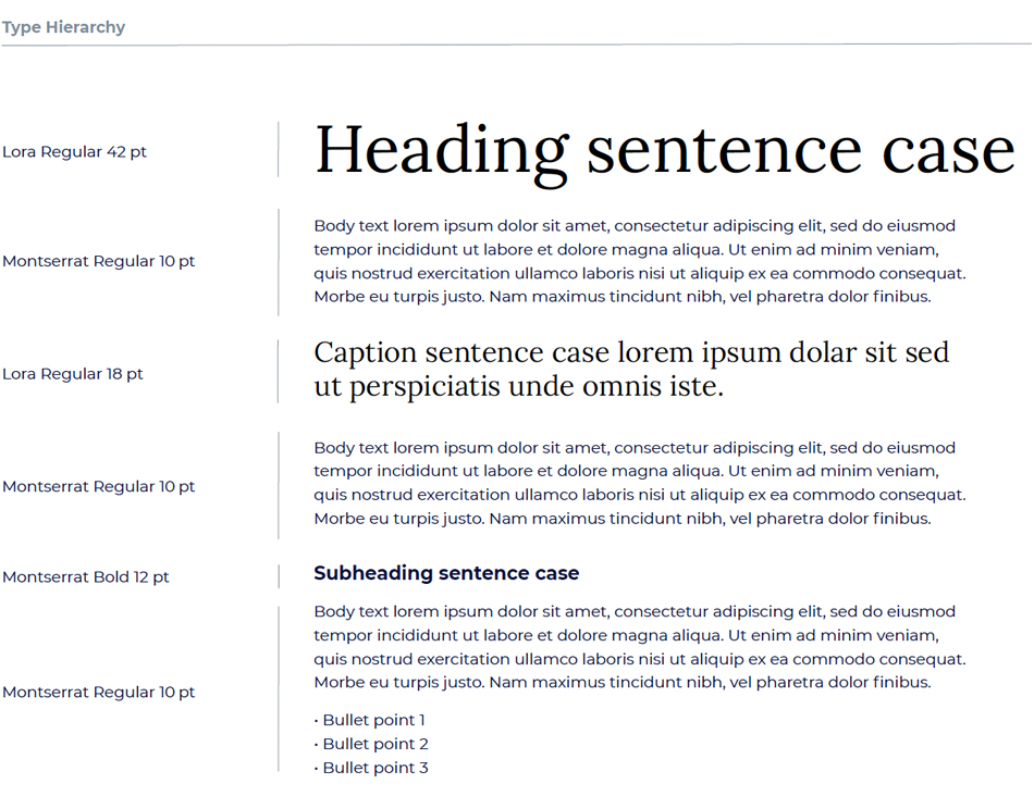
The image below shows how our primary and secondary typefaces can be paired to create hierarchy, variation and interest in layouts.
The type sizes used here were chosen for the relationship to each other and the scale of a 16"x9" page. They do not need to be followed exactly but serve as a guide to when and where each typeface is used and at what scale it should be used. For larger or smaller format layouts, sizes should be increased or decreased proportionally, within reason, to maintain clarity and legibility.
